BBM6 Jaccard Charts and Analysis
With the Best Ball Mania 6 data released, and slappies everywhere panicking that they have too much early-round rookie RB exposures... and not enough double-digit-round rookie RB exposure, it's time for my annual tradition of publishing the Jaccard similarity charts.
If you're new around here, or simply haven't committed the time to reading extremely nerdy articles about portfolio diversification and risk management with respect to best ball, I'd recommend reading my article series on the topic (and Pat's extended metaphor article that really helps tie it all together). These articles will give you the context you'll need to get the most from the Jaccard data and charts in this article:
- Stop Diversifying Your Picks. Start Diversifying Your Teams.
- The Tree of Jaccard
- A Dash of Diversification
- Best Ball Mania V Jaccard Similarities and Diversification Percentiles
In short, Jaccard similarity is a metric that we can use to measure how diversified our teams are on a portfolio level. It's a useful metric to let us know how correlated our teams are to one another. As I've continued my work with Jaccard similarity, I've tried to make these metrics more and more actionable. My objective is to help drafters understand not only how much risk they're taking with their drafting strategies, but also where that risk may be concentrated.
In more traditional portfolio management exercises, it's simply a math problem. We can quantify the risk and the return profiles of assets, do the math, and solve for a nice, neat, optimized portfolio.
In best ball it's also an exercise in thoughtfulness, as the majority of drafters haven't quantified the range of outcomes for every individual player, and certainly not to the degree necessary to optimize a portfolio.
While we are quantifying the range of outcomes for every individual player with the Sidekick, I still think it's beneficial to equip drafters with the tools they need to understand the risks in their own portfolio.
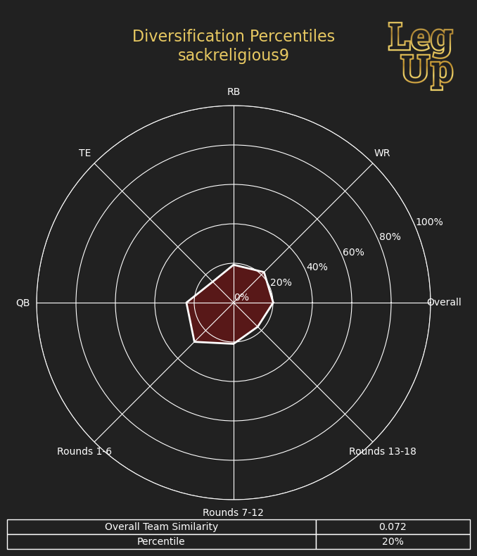
That's why I decided to give Jaccard charts a makeover this season. Before you panic, don't worry, I'll still be including the radar charts that you've become accustomed to.
A big motivating factor for the makeover is that I found the percentiles not particularly useful for analysis. The actual difference between the Jaccard similarity scores from the 100th percentile to the 25th percentile is so small, that I was worried I was encouraging drafters to overly focus on their diversification percentile, rather than what it actually meant and how it impacted their risk.
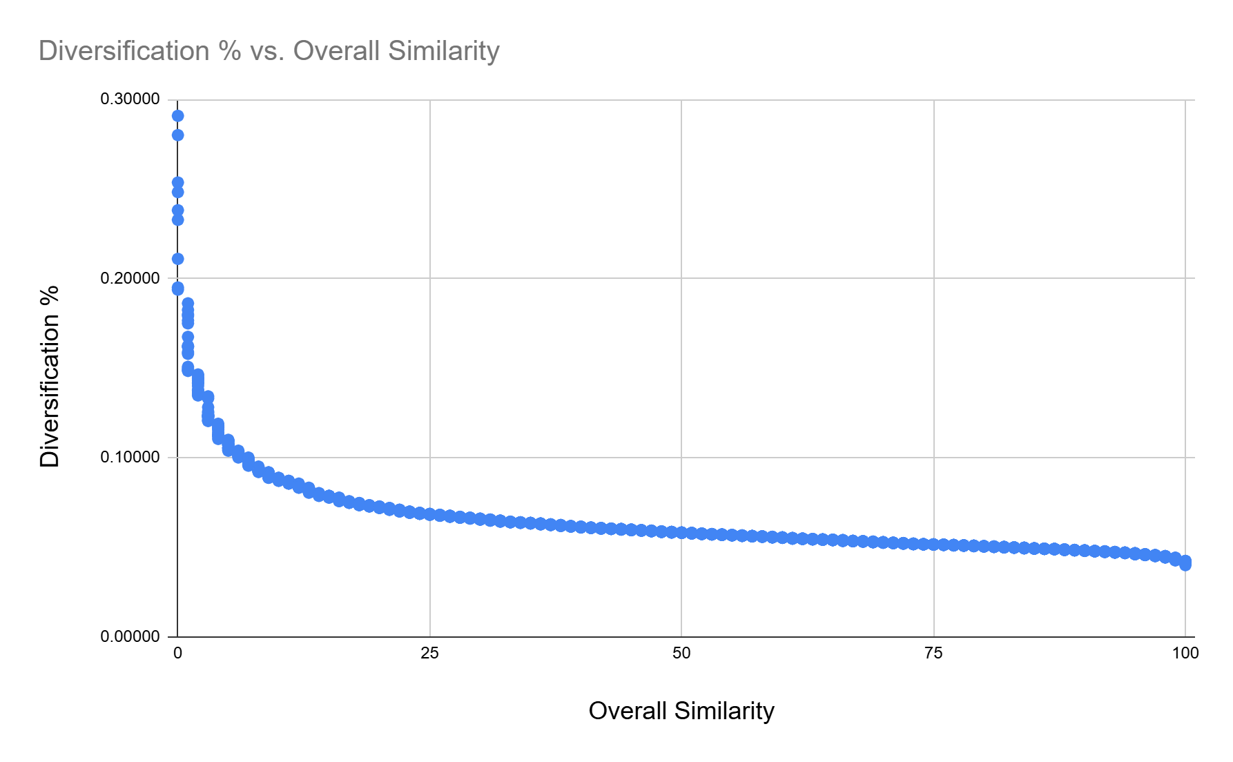
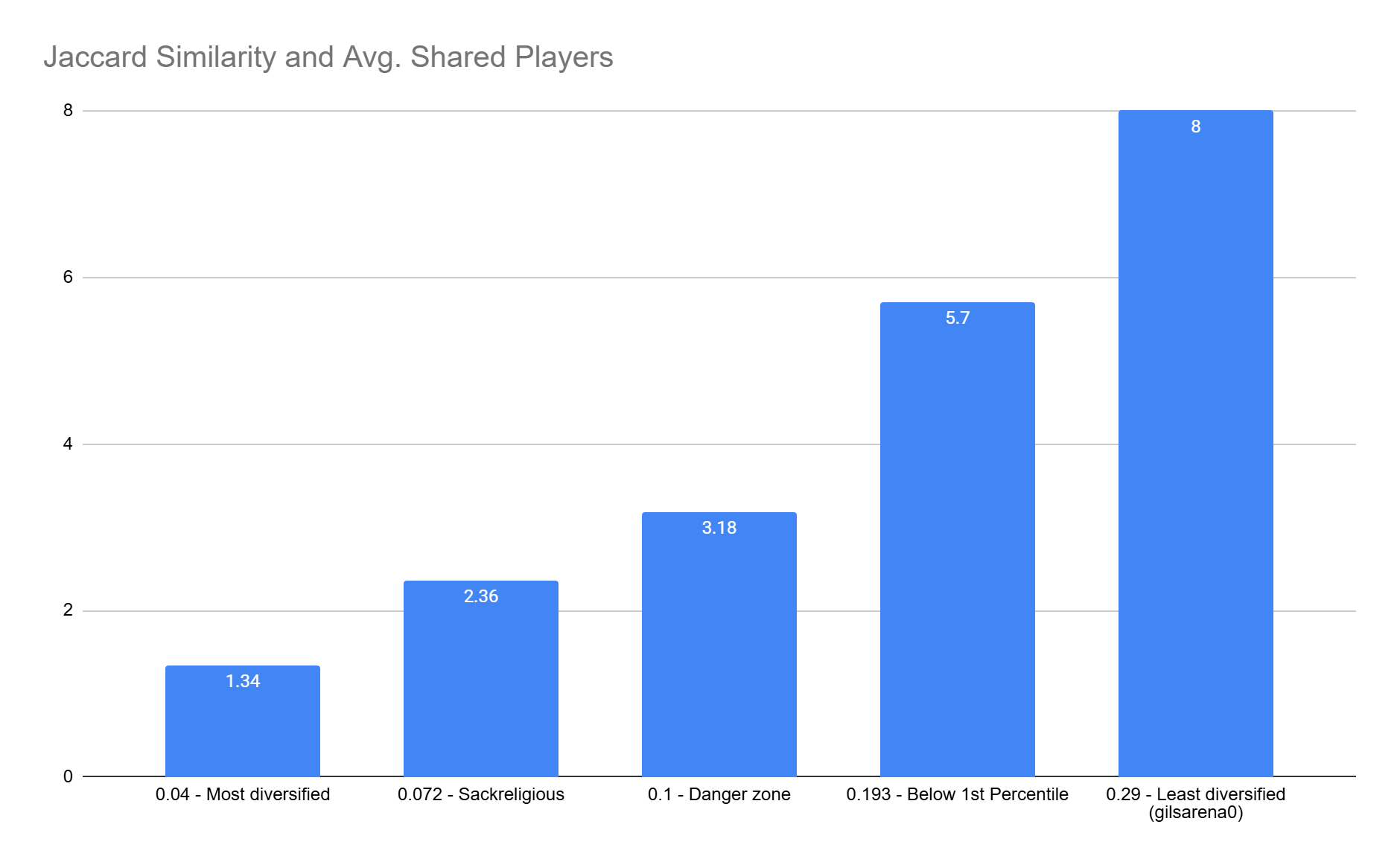
But even the raw similarity scores aren't something that's easy to interpret for most people (I multiplied them by 100 this year so we didn't have to deal with pesky decimals). So I decided to include the average number of shared players as a new metric. If you were to randomly select 2 teams from a drafter's portfolio, this Average Shared Players number is the overlap you'd expect between any two teams:
My hope is that looking at Jaccard similarity through this lens makes it more digestible and easier to apply when thinking through portfolio risk management.
On the new charts, if you see a Jaccard similarity greater than 10 in any category, that's a pretty big warning that you took on quite a bit of risk by being overly concentrated.
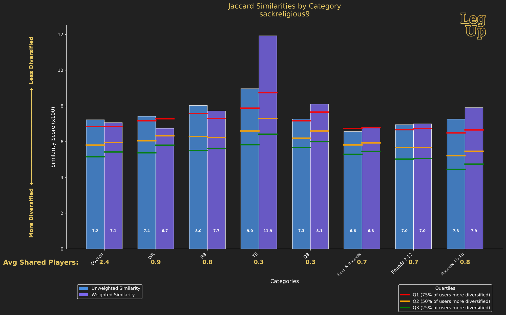
Below you'll find the new Jaccard chart, here are some of the new features:
- Bar charts for each category, as the area encompassed by the radar chart wasn't particularly meaningful
- A draft capital weighted and unweighted similarity score for each category
- Raw Jaccard similarity score displayed on each bar, rather than using percentile values
- Quartile thresholds marked on each bar to show you how diversified you are relative to the field, without placing as much emphasis on your specific percentile
- Average Shared Players displayed beneath every category, to help translate the Jaccard similarity score to a more intuitive metric
Weighted vs Unweighted Score
The chart below has two bars for each category: an unweighted and a weighted Jaccard Similarity Score.
The unweighted score is simple, it measures the average similarity of any two rosters across your entire BBM portfolio.
The weighted score just adds in draft capital, so players drafted earlier have a larger impact on the weighted score than players drafted later.
It's important to consider both of these scores and how they relate to one another.
The unweighted score is a better measure of how diversified you were at a given position or set of rounds. The weighted score is a better measure of how much risk you took on at each position or in each set of rounds.
For example, in the chart below, my weighted similarity is generally lower than my unweighted similarity. This implies that my player stands were smaller in the earlier rounds. In other words, while I was less diversified overall than about 75% of other drafters, my portfolio contains less risk than if I were slamming the same group of players repeatedly in the early rounds.
The exception to this is the TE position, where I have huge overweight positions on both Bowers and McBride, and the QB position, where I was significantly overweight on Lamar. Below you can see that my weighted score is significantly higher than my unweighted score at tight end, reflecting a concentrated (and high-risk) approach to tight end.
My weighted QB score is also higher than my unweighted score—my aggressive Lamar position added some risk. But, overall, my approach at QB was less risky than my approach at TE.
One last note on Rounds 13-18: because draft capital gets very close to zero near the end of the draft, having a higher weighted similarity than unweighted for Rounds 13-18 will be the norm. Basically, even if you take a lot of the same players at the very end of drafts, it's hard for unweighted similarity to ever be higher than weighted similarity because players in the last few rounds have little to no draft capital.
My Portfolio Breakdown
My portfolio of BBM teams was less diversified than >75% of all other drafters who max entered the contest.
As discussed above, I'm also taking on risk at the tight end position.
However, the TE position is the only place in my portfolio that I would identify as significant risk exposure. In taking on positional risk, I want to validate that the degree of risk I'm accepting at a position is consistent with my evaluation of the position group as a whole. When accepting this degree of risk, you need the potential for outsized returns, which was certainly consistent with my evaluation of Bowers and McBride relative to the rest of the position.
Even though the rest of my metrics are all near or above the 75th percentile, that's not a particularly concerning threshold for me. Think of that 75th percentile line as a flag for you to check your portfolio in that category, but it's far from a flashing red warning sign.
The phenomenon I discussed above regarding weighted vs. unweighted similarity in rounds 13-18 is true across all of the round-by-round categories. Players being drafted earlier in the subsets of rounds have higher draft capital than players being drafted later. This causes a bias where weighted similarity will often be higher than unweighted when looking at the round-by-round categories. We still can get signal from these categories regarding our portfolio risk; we just need to modify our baseline expectation and understand that weighted similarity will likely be higher by default.
Looking at weighted similarity by round (First 6 Rounds, Rounds 7-12, Rounds 13-18) shows that I had some stands in the early rounds, but not a disproportionate amount of very early picks (rounds one and two) relative to later picks (rounds five and six).
I was then relatively balanced in how I took my stands in the middle rounds (no bias towards earlier players or later players in those rounds). In rounds 13-18, I had stands on some players that were going in rounds 13-16 that outweighed the stands I had in rounds 17 and 18.
Radar Chart and Downloadable Data
Alright, I promised you radar charts as well, so below is my BBM6 radar chart:
And of course, here's the good stuff, an Excel file with all of the Jaccard data, as well as a zip file with all of the charts for every max entry drafter in BBM6, as well as users who submitted their name to request their charts in the LegUp discord: